Design principles that work great on paper should work just as well on your website right?
Unfortunately, nope. Over the years, researchers have studied how people view web pages to find what they’re looking for – and what works on a printed poster doesn’t work nearly as well on a small business web page!
If people can’t find what they’re looking for on your site, you could lose sales. Below you’ll find our top “No-Nos” for laying out your site.
1. Don’t align your text down the middle
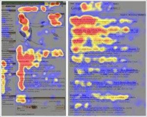
Researchers have found that pages with a lot of text on them tend to be read in an F-shape pattern, as indicated by the heatmap below. The more colorful areas indicate where the visitors eyes looked at the most.
With that in mind, you’ll want to place your most important content where their eyes will be searching: in the headline and along the left.
Read More
